


New Reporting
Stacked Area Graphs
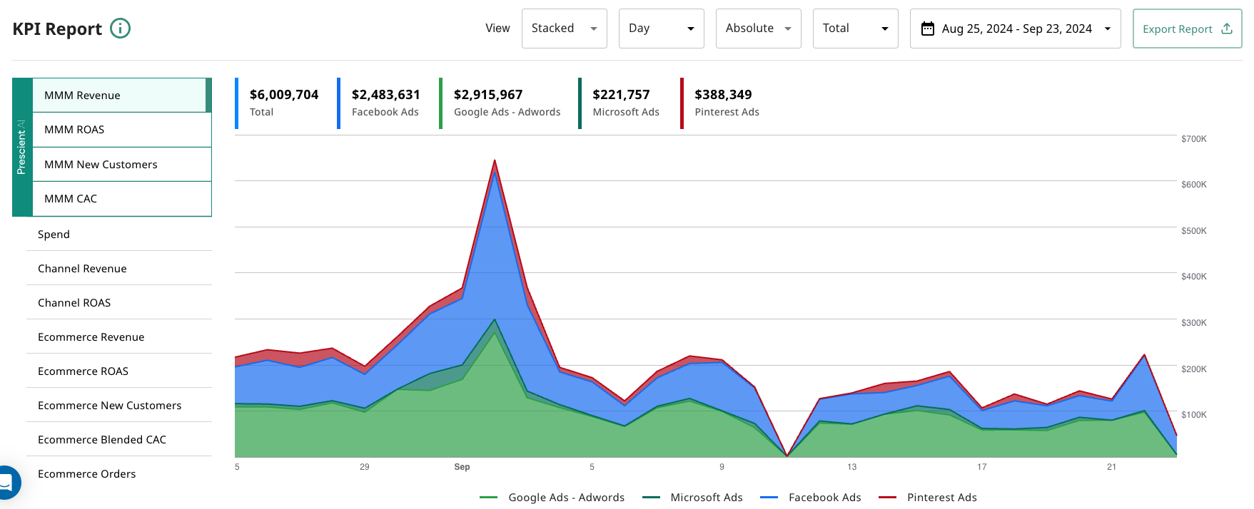
Our users asked us for a new way to visualize time series data on the KPI card on the homepage. We answered this demand by adding in the option for a Stacked Area chart, in addition to the classic line time series chart. To toggle on this feature, simply use the View As toggle, and select Stacked.
Our users asked us for a new way to visualize time series data on the KPI card on the homepage. We answered this demand by adding in the option for a Stacked Area chart, in addition to the classic line time series chart. To toggle on this feature, simply use the View As toggle, and select Stacked.
Here is a sample of the what the stacked area chart looks like: